Unicorns Live in Venn Diagrams: What to Expect from Data Science for Healthcare, and What is Missed When Too Much is Expected
Unicorns Live in Venn Diagrams:
What to Expect from Data Science for Healthcare, and What is Missed When Too Much is Expected
Oleg Roderick, Ph.D. and Nicholas Marko, MD
Geisinger Medical Center, Danville, PA USA
Like every other advance field, the healthcare industry is becoming integrated with predictive analytics and machine learning. Medical specialists, and, to some extent, patients, are evolving into discriminating consumers, almost connoisseurs, of statistics and data mining. In this time of transformation, many will quickly make up their minds regarding a definition of data science and what to expect from it as a manager, physician, patient or citizen. As an opinion is solidified, it may turn out to be naïve, or confrontational, or needlessly paternalistic. Before it happens, let’s try to set some definitions and expectations straight.
This short essay is motivated by statements our data science team at Geisinger Health System seems to overhear regularly, at every healthcare and data science meeting we attend.
Speaker 1: “Our analysis is the best because it produced a scientific insight, a new understanding of the contributing factors and a mechanism behind a socio-medical phenomenon.”
Speaker 2: “Our analysis is the best because other mathematical representations of a medical process predict correct outcomes dramatically less often.”
We may guess that perhaps Speaker 1 is a medical professional or perhaps a computer scientist who realized that, without an understanding of a mechanism behind a process, one should probably not try to simulate the process.
Speaker 2 is probably a qualified programmer, but he could be a physician who sees merit in blindly knowing the outcome, ahead of time, in 95% of the cases.
When these types of statements are made, we may respond, “Our analysis is the best because we ask precisely the right question. We believe that it is better to obtain an approximate answer to a very good question, than the other way around.”
Some sort of taxonomic play is going on here, a sequence of trade-offs between medical expertise, mathematical rigor and computational power. Perhaps truly effective analysis occurs on the intersection of multiple fields of study. This view is illustrated by a popular Venn diagram (by Steve Geringer, licensed under creative commons, 2014).
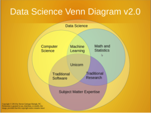
We mainly like this picture for the reference to the Unicorn, a universal specialist that can work with equal competence and objectivity in three exclusive fields. In our case, those fields are: clinical research, mathematics and software development. This individual is sought for in many job descriptions. Like a unicorn, this individual is generally hard to find.
To center the view of a professional world on a non-existent entity seems elitist, perhaps even damaging for morale. We offer our own, more optimistic take on the subject, also with a Venn diagram, and with more options for unicorn placement. Our lowercase unicorns are definitely possible to find. They also have different character flaws that must be weighed against each other in deciding which definition of “best” is more effective. Here is the picture.
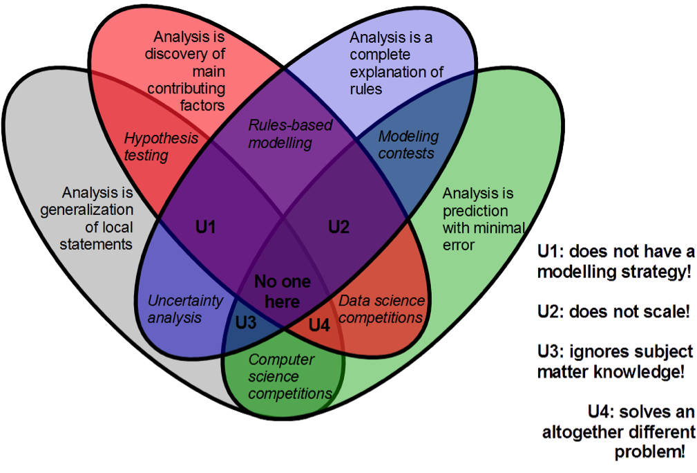
We have reviewed many healthcare informatics papers, and color-coded the most common answers to the question: What is scientific, data-driven analysis for healthcare applications?
Analysis is discovery [of contributing factors].
Analysis is prediction [with best quality].
Analysis is understanding [of rules and relationships].
Analysis is generalization [on local knowledge].
Many medical publications are red: they contain analysis of features and outcomes for patients with a medical condition, and often conclude with a list of factors contributing to risks of developing the condition, sorted by their statistical significance. Reports on innovation (in technology, pharmacology, or cost savings) are green; their narrative builds up to metrics of quality. This metric is often an abstract, widely applicable quantity, abbreviated: RMSE, AUC. Educational material is blue, in fact this article that you are reading is very blue, since we are offering a comprehensive classification. Management guidance material and literature on modern computing techniques are both grey because there is something of common upbringing here, from street smarts to flowcharts and the word “at scale”.
But no mature research of development activity is so chromatically pure; they naturally overlap in a variety of ways. Combine two colors, and you get different activities that make up the routine of modern data science.
For example, data science competitions (a popular modern way of crowd-sourcing data analysis, and also a way for medical experts to learn programming) are red + green. Winning teams are either very lucky, or have an expert insight into what features to include in the model. And then they refine their chosen algorithm to perfection. The specific algorithms developed in data science competitions are not guaranteed to be useful because they are not general enough; also, the scientific value may be low, because to predict well is not the same as to explain.
Blue + grey gives us a theme of uncertainty analysis. It is also known as sensitivity analysis, but the former term is wider, covering propagation of all types of uncertainties and unknowables through the decision process, not just numerical perturbations. In healthcare, it is associated with cost-effectiveness studies. A researcher lists all the parameters that cannot be precisely determined, and then makes a statement on how these local phenomena, acted upon by deterministic rules, result in a range of possible outcomes, rather than just one output.
These are just a few of the possibilities.
Combine three colors, and you have a lot of different kinds of knowledge, all working together for the common purpose. Many scientists will tell you that organizing multidisciplinary studies is hard, because “people are not talking to each other”. Synthesis of opinions on what is quality takes a significant effort, and the faults become more obvious for that. Whatever is missing is now really missed.
In our picture, unicorn 1 has no numerical estimation of quality = we are not sure how to tell apart good and bad results, so there is not strategy for improvement, just some narratives, each of them appealing in some way.
Unicorn 2 operates on one scale only: either on big data only, and on the relatively trivial operations of search and classification that are possible at such scale; or on local data only, with representations that are very convenient for visual inspection but do not generalize.
Unicorn 3 has no discrimination ability: all data is potentially an input into the model, all outcomes are interesting in their own way.
Unicorn 4 has no causal, rule-based explanation, and we don’t really gain human knowledge as a result of the study. We solved a scientific problem of some kind, but what was it, what question did it answer?
Now we are ready to address the original question: What flavor of analysis is best? Our advice is to minimize the disappointment and ask: What flaw do you want to avoid the most? Then you can wisely select any paradigm that does not have it.
Combine all four colors, and you would get a true Unicorn: a perfectly guided study that makes everyone involved extremely unhappy because, for the amount of effort spent, their favorite definition of successful analysis was not given enough attention. So we leave the center of the picture empty, and advise the reader not to pursue it.