Graphing a Lesson Learned Database for NASA Using Neo4j, R/RStudio & Linkurious
 [As community content, this post reflects the views and opinions of the particular author and does not necessarily reflect the official stance of Neo4j.]
Ask any project manager and they will tell you the importance of reviewing lessons learned prior to starting a new project.
Lesson learned databases are filled with nuggets of valuable information to help project teams increase the likelihood of project success. Why then do most lesson learned databases go unused by project teams?
In my experience, they are difficult to search through and require hours of time to review the result set.
Recently I had a project engineer ask me if we could search our lessons learned using a list of 22 key terms the team was interested in. Our current keyword search engine would require him to enter each term individually, select the link and save the document for review. (By the way, there was no way to search only the database. The query would search our entire corpus, close to 20 million URLs.) This would not do.
I asked our search team if they would run a special query against the lesson database only, using the terms provided. They returned a spreadsheet with a link to each document containing the term or terms. Over 1100 documents were on the list. The engineer had his work cut out for him.
I started thinking there had to be a better way.
I had been experimenting with topic modeling, in particular to assist our users in connecting seemingly disparate documents through an easier visualization mechanism. Ideally, something better than a list of links on multiple pages.
I gathered my toolbox: R/RStudio, for the topic modeling and exploring the data; Neo4j, for modeling and visualizing the topics; and Linkurious, a web front end for our users to search and visualize thegraph database.
Building the topic model
All the code and data can be found at my GitHub repository. In this article, I will focus on the R andCypher code to work with Neo4j. I will demonstrate the topic modeling code in a future article.
For this demonstration, I exported over 2,000 lessons from our public NASA Engineering Network lesson learned database. The data was fairly clean and contained some useful metadata.
The steps for creating the topic model are:
- Create the corpus.
- Create the document term matrix to use in the model
- Determine the optimal number of topics for the model. (In topic modeling the k topics needs to be known. I currently use a harmonic mean approach. For this data, 35 topics was determined to be optimal.)
- Run the model
Since documents can be in more than one topic, I extracted theta (the per-document probabilities) from the model and assign each document its most diagnostic topic. In turn, I extracted the top thirty terms for each topic, in rank order, created a label for each topic based on the top three terms and correlated the topics based on the Category metadata associated with each document. All of this information would help develop my graph model.
I am jumping ahead here, however I wanted to show how you can visualize your graph database in R using the RNeo4j and visNetwork package. (See Nicole White’s blog post, Visualize Your Graph with RNeo4j and visNetwork for more.)
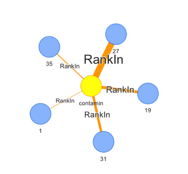
Assuming I have already created the database, the first query I ran returned the term “contamin” and the topics the term was in.
The edge weight was determined by the rank of the term in the topic. The thicker the edge, the higher the term ranked in the topic. The next query returned all the lessons for Topic 27. Finally, I visualized the model in R using the LDAvis package.
I could see the top thirty terms for each topic and how those terms were distributed among the other topics. While this was helpful to me, it wasn’t what I needed for the end user. I then saved all the lesson information in CSV files to import into Neo4j.
Figure 1: Term query in R

Figure 2: Topic query in R
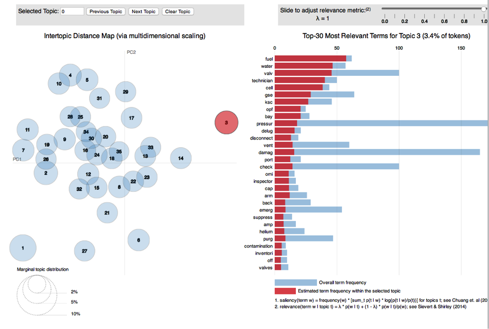
Figure 3: Visual of topic model using LDAvis
Building the Graph Database
If you are just beginning to work with graph databases and Neo4j, you need to read Nicole White’s blog. The next section is based on her webinar Using Load CSV in the Real World.
Having been born in the eight-track era, I decided to first model my graph on a whiteboard. I drew a rough outline showing the various connections of the proposed nodes in the graph. It is fairly simple; however, I found it helps keep me focused on the model.

Figure 4: Lesson learned database graph model
To create the nodes, I imported the data I created above using LOAD CSV in Cypher.
The first section of code creates a unique constraint for the lesson node, preventing any duplication of lesson IDs. Reading the CSV file, a lesson node is created and properties are set.
The properties were extracted from the metadata associated with each lesson. As Nicole suggested in her webinar, I split the date up into three parts. I will use the year property later to assign a weight to an edge. The newer the lesson, the larger the edge will be. Each lesson node will also contain properties for the abstract, the lesson itself (if available), the directorate the lesson originated from, whether it was a safety issue and a link to the lesson on the NEN website.
// Nodes created for Lessons, Submitter, Center and Topic
// Relations created
// Uniqueness constraints.
CREATE CONSTRAINT ON (l:Lesson) ASSERT l.name IS UNIQUE;
// Load.
USING PERIODIC COMMIT
LOAD CSV WITH HEADERS
FROM 'file:e:/Users/David/Dropbox/doctopics/data/llis.csv' AS line
WITH line, SPLIT(line.LessonDate, '-') AS date
CREATE (lesson:Lesson { name: TOINT(line.`LessonId`) } )
SET lesson.year = TOINT(date[0]),
    lesson.month = TOINT(date[1]),
    lesson.day = TOINT(date[2]),
    lesson.title = (line.Title),
    lesson.abstract = (line.Abstract),
    lesson.lesson = (line.Lesson),
    lesson.org = (line.MissionDirectorate),
    lesson.safety = (line.SafetyIssue),
    lesson.url = (line.url)
Many of the nodes are associated with multiple lessons in the CSV file. The MERGE command will create the node if it does not exist or match it if it does.
// Merges multiple entries of node in CSV file
MERGE (submitter:Submitter { name: UPPER(line.Submitter1) })
MERGE (center:Center { name: UPPER(line.Organization) })
MERGE (topic:Topic { name: TOINT(line.Topic) })
MERGE (category:Category { name: UPPER(line.Category) })
Once the nodes were completed, I created the relationships between the nodes. A lesson is contained in a topic, was written by a submitter, occurred at a NASA Center and fell into a particular category.
CREATE (topic)-[:Contains]->(lesson)
CREATE (submitter)-[:Wrote]->(lesson)
CREATE (lesson)-[:OccurredAt]->(center)
CREATE (lesson)-[:InCategory]->(category)
;
Here is the finished result showing two lesson nodes and their relationships:

Figure 5: Lesson node and relationships
In the R code, I calculated the most representative Category for each topic and saved it into a CSV file, which I now load into the graph database. Since the nodes were already previously created, I used the MATCH function to get the node then create the relationship of the topic to the category.
// Topic, category.
// Adds the category node and creates a relations to the topic
// Load.
USING PERIODIC COMMIT
LOAD CSV WITH HEADERS
FROM 'file:e:/Users/David/Dropbox/doctopics/data/topicCategory.csv' AS line

MATCH (topic:Topic { name: TOINT(line.Topic) })
MATCH (category:Category { name: UPPER(line.Category) })

CREATE (topic)-[:AssociatedTo]->(category)
;
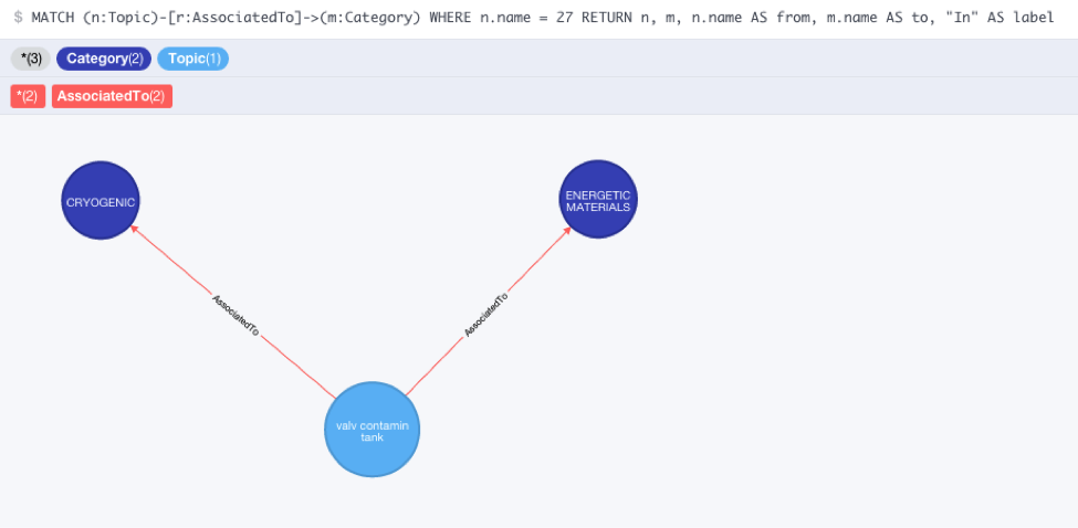
Figure 6: Topic associated to category
Having correlated the Topics, I could then add that relationship to the nodes. Since I was using an undirected relationship, I discovered I needed to use MERGE to create the edge.
I could then use this property later to query the database to find other Topics which might contain lessons that have a connection to a lesson I am interested in.
// Topic, Correlation.
// Adds a relation to each topic using their correlation as a property of the relationship
// Load.
USING PERIODIC COMMIT
LOAD CSV WITH HEADERS
FROM 'file:e:/Users/David/Dropbox/doctopics/data/topicCorr.csv' AS line

MATCH (topic:Topic), (topic2:Topic)
WHERE topic.name = TOINT(line.Topic) AND topic2.name = TOINT(line.ToTopic)

MERGE (topic)-[c:CorrelatedTo {corr : TOFLOAT(line.Correlation)}]-(topic2)
// MERGE is used because it is non directed relationship
;
The following Cypher code creates the nodes for the top thirty terms in each topic, creates the edge between the term node and the topic node, setting the rank relationship property to the terms rank in the topic, and lastly, sets the label property in the topic node that the label generated in the R code.
// Topic, Terms.
// Creates term nodes and relationship to topic by the rank the
// term is in the topic. A rank of 1 means that the term is the most
// frequent in that topic
// Load.
USING PERIODIC COMMIT
LOAD CSV WITH HEADERS
FROM 'file:e:/Users/David/Dropbox/doctopics/data/topicTerms.csv' AS line
MATCH (topic:Topic { name: TOINT(line.Topic) })

MERGE (term:Term { name: UPPER(line.Terms) })

CREATE (term)-[r:RankIn {rank : TOINT(line.Rank)}]->(topic)
;

// Topic, Labels.
// Creates label property for each topic by using the top 3 ranked terms in the topic.
// A rank of 1 means that term is the most frequent in that topic
// Load.
USING PERIODIC COMMIT
LOAD CSV WITH HEADERS
FROM 'file:e:/Users/David/Dropbox/doctopics/data/topicLabels.csv' AS line
MATCH (topic:Topic { name: TOINT(line.Topic) })

SET topic.label = line.Label
;
To show you how to extract some information from the graph database in Neo4j, here are some sample queries and their results. Both the graph and row version are displayed below.
This query returns the lessons in Topic 27:
MATCH (n:Topic)-[r:Contains]->(m:Lesson)
WHERE n.name = 27
RETURN n, m,
n.name AS from,
m.id AS to,
m.title AS title,
(m.year) AS value,
"In" AS label

Figure 7: Lessons in Topic 27, graph view
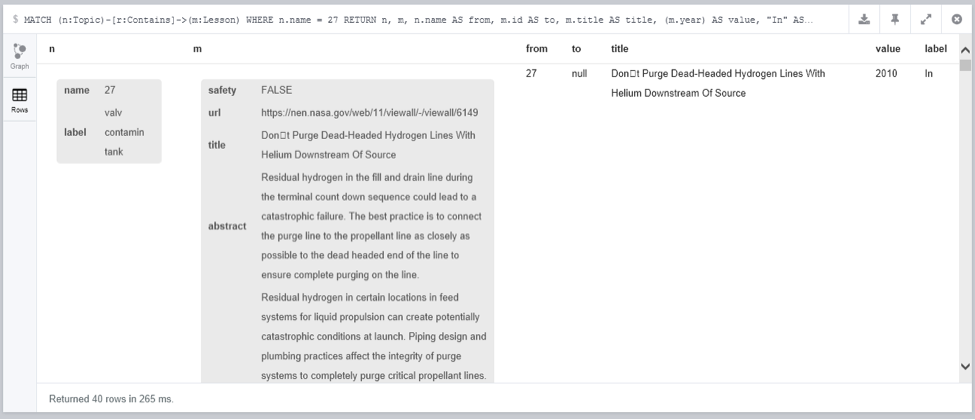
Figure 8: Lessons in Topic 27, row view
Topics correlated to Topic 27 with a correlation greater than 0.02:
MATCH (n:Topic)-[r:CorrelatedTo]->(m:Topic)
WHERE n.name = 27 AND (r.corr > 0.02)
RETURN n, m,
n.name AS from,
m.id AS to,
m.title AS title,
(m.year) AS value,
"In" AS label

Figure 9: Topics correlated to Topic 27 with a correlation greater than 0.02
Topics with correlation greater than 0.40: I am still working on this as it also shows all the correlations for each topic.
MATCH (n:Topic)-[r:CorrelatedTo]->(m:Topic)
WHERE r.corr > 0.40
RETURN n, m,
n.name AS from,
m.name AS to,
(r.corr) AS value

Figure 10: Topics with correlation greater than 0.40
All topics correlated to Topic 27: The edge label is the numeric correlation value.
MATCH (n:Topic)-[r:CorrelatedTo]->(m:Topic)
WHERE n.name = 27
RETURN n, m,
n.name AS from,
m.name AS to,
(r.corr) AS value

Figure 11: All topics correlated to Topic 27
User Visualization
Now I have all the data in my graph database, yet I still need to make it easier for my end users to search and connect lessons based on their criteria.
In Learning Neo4j, several visualization options were mentioned. I evaluated several of the applications and for this demonstration I settled on Linkurious, a web-based interface for users to search and visualize graph data.
Linkurious was designed to connect to a Neo4j database and requires the Neo4j database to be running before you start it. Upon opening the application you are presented with this dashboard:

Figure 12: Linkurious dashboard
Since Linkurious comes with a built in instance of Elastic Search, you can search through all the nodes and edges if you desire. See the example below:

Figure 13: Linkurious Elastic Search
The real benefit comes when you create your first visualization. Let’s assume I am looking for lessons that may contain the terms, “fuel,” “water,” “valve” or “failure.” I am shown the Lesson node with lessons containing some of the words, the Term node for two of the terms, and a Topic node that contains three of the terms as its label.
Remember, the label was created using the top three terms for each topic. Therefore, it is safe to assume the terms appear frequently in lessons contained in Topic 2 and the lessons pertain to fuel valve and/or water valve issues.

Figure 14: Searching the database
By clicking on Topic Two, the node appears on my canvas.
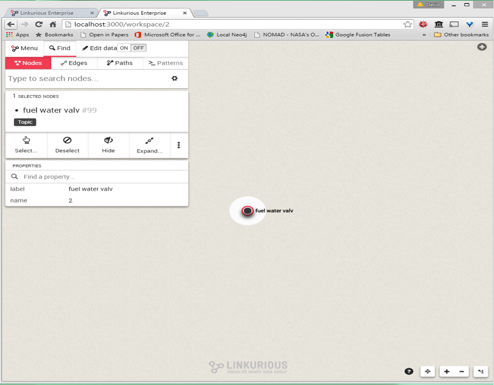
Figure 15: The Topic Two node
I can begin exploring the given topic and uncover relationships. Since the topic is related to four other nodes, I am given an option to select the nodes I want to display on the screen.
Selecting the Lesson node, I am able to display all of the lessons contained in this topic. You can make adjustments to the visualization to add color and size. In this case, each node type is a different color and the node size is determined by the year the lesson was written. The newer the lesson, the larger the node.
Properties for each node are displayed to the left. In the image below, you can see information on the highlighted node and if the user wants to visit the site where the lesson is stored, they can click on the URL in the properties.

Figure 16: Individual lessons within Topic
I can continue to explore my data. By clicking on the highlighted lesson node, its edges are displayed, giving me the author of the lesson, the Center it occurred at and the Category it is associated to.

Figure 17: Exploring the Lesson Node
Returning to the topic node, I can click on it again, this time selecting to display the Categories associated to it. I can then explore the Category node to see lesson associated with Risk Management, Energy, Power or Ground Support Systems, allowing me to find other lessons that are closely aligned to what I am looking for.
You simply cannot see these connections in a keyword search list.
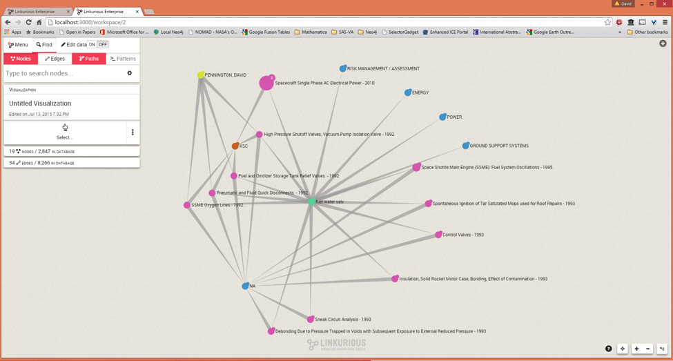
Figure 18: Adding Category nodes

Figure 19: Exploring Category nodes
I believe Neo4j, R/RStudio and Linkurious will allow me to explore and visualize my data in ways our current search engine cannot do. While this is still a work in progress, I believe using a graph database in this manner can provide users with a more effective search experience, reducing their time to find answers and allowing them to start their project on the right foot.
The combination of these tools gives analysts the ability to create excellent analytical and visual representations of large document repositories.
Feel free to reach out to me on Twitter if you have any questions or suggestions.
Get started on your own graph-based search project today. Click below to download this free white paper The Power of Graph-Based Search and strengthen your search tool with a graph database.